
Now is an opportune time to revisit your learning measurement approach. With organizations
shifting their learning to digital formats, measurement enables you to determine what’s working,
what you need to change and where to prioritize your improvement efforts. At ETU, we work
with our clients to understand the bigger story within their data. Our guidance to our clients
during this process is that data is only meaningful if it is clean, organized and displayed in a
clear and compelling way. We follow a step-by-step process for data analysis. The process
begins with planning using a logic model that produces a graphical view of the relationships
among the resources, activities, outputs, outcomes, and impact for your program. The plan
resulting from your logic model (illustrated as Step 1 in Figure 1, below) enables you to answer
your stakeholders’ questions about:
- the efficiency of your program (did this program use a cost-effective design and
development approach?) - the effectiveness of the program (did the program deliver value, build new skills and
drive new behaviors?) and - the impact of the program (did it meaningfully contribute to business results?)
Your measurement plan guides your data collection effort (Step 2 in Figure 1 below). If your
program is simple, you may only gather survey data at the conclusion of the training. However,
if your program is more complex, you may collect data from several sources, including pre- and
post-assessments, surveys, the output of simulations, focus groups, and extractions of HR and
business data.
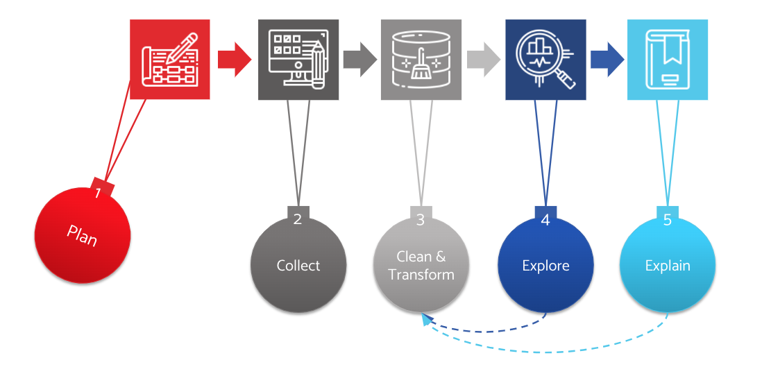 Clean and transform your data
With planning and collection complete, you are now ready to start the analysis, correct? Not quite. While it is tempting to skip to data analysis, you first need to get your data into shape. No data comes in pristine form. Cleaning data ensures that it is complete, consistent, uniform, and valid. This step ensures that you can stand by your analysis. Who wants to have a big reveal only to find that it was faulty because of dirty data?
Data cleaning removes duplicates, fixes structural errors, addresses missing data and uncovers anomalies or outliers. While it would be nice to think that this process is one-and-done, in most analysis efforts, you will continue to clean your data even as you explore and explain it. As you visualize or summarize your data, you may find yourself saying, “this doesn’t make any sense.” And when you do, your first step is to double check that your data does not contain systemic errors that are creating spurious results.
During Step 3 of our process, you may also need to transform your data. This step involves reshaping your data to conform to the requirements of your analytical tool, be it Excel, Power BI, Tableau or SPSS. While this step is not a load of fun, it’s critical to get to Steps 4 and 5.
Next step: data exploration
By this point, you may feel worn out. Such a lot of work and not even a graph or chart to show for it. But keep at it, because the interesting part of the process begins here. The goal in Step 4 is to explore your data and uncover patterns, trends, and interesting relationships. Data exploration is often unstructured, but if you have used the logic modeling process, you can focus your exploration on the areas that stakeholders care about.
There are several components to data exploration:
- Descriptive analysis helps you uncover basic patterns within the data. Descriptive analysis includes comparing sample sizes for different data breakdowns (e.g. by region or business unit), exploring means, variances, and the distribution of responses (e.g. how many learners passed vs. failed). For example, one organization noticed that its leadership course had varied performance in different geographies. The vendor delivering the course had high scores and low variability in the US but low scores and high variability in Asia. The client investigated and discovered that the vendor had never taught in Asia and its approach was not culturally compatible. Based on a simple examination of means and variances, they realized they should replace their vendor in Asia.
- Hypothesis testing enables you to confirm your initial expectations about the data. For example, your business leaders believed that employees in Europe and the US would score similarly on your design thinking course assessment. Did that projection bear out or not? Hypothesis testing compares distinct groups to see if your initial expectations (hypotheses) were confirmed by the data.
- Data visualization is another critical element of data exploration. This process encodes a large amount of data into a graph, chart, or table to enable insights. Data visualization is an effective and efficient way to uncover relationships, patterns, or trends in the data through charts or graphs.
Experiment with data visualization
Before you move to Step 5 to explain your data, it is important to understand the role of data visualization in the exploratory process. Data visualization is a much an art as science with hundreds of books and thousands of websites devoted to the topic. Here are five tips to keep in mind for exploratory data visualization:
- Make it relevant to the audience. Focus on what your stakeholders care about, not what you think is cool or interesting.
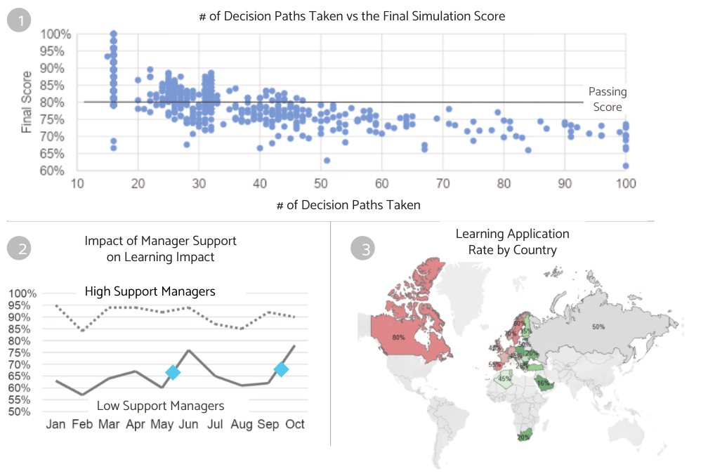
- Keep it simple, remove clutter and non-data ink. You want the insight to pop out. Use light grays and thin lines for the axes and grids. Remove shadows and anything ‘fancy’ that detracts from the story in the data. The scatter plot in Chart 1 below shows the data points in blue and uses gray tones for everything else.
- Less is definitely more. If you have too many bars in a chart, consider showing multiple smaller charts with less data (known as “‘small multiples”) that highlight differences quickly.
- Make your data the main attraction. Use visual cues strategically to guide the audience and draw their attention, but let the data tell the story, not the design. See Chart 2 below that highlights two major events in the timeline with blue diamonds.
- Experiment with different visualization approaches. While trend lines are appropriate for time series data, sometimes bar charts will be more revealing. Consider geo charts such as Chart 3 below to make regional differences pop out. Ask yourself if a viewer can understand the message simply by looking at the chart. If not, try another visualization method.
See the links to resources at the end of this post to learn more data visualization.
The final step: data explanation
This step moves you from exploring the data to explaining what you have found, and it should accomplish three objectives:
- Tell a story: a) define the issue or business problem, b) convey what your analysis reveals about organizational performance and c) recommend concrete actions to address the findings. Beginning, middle and end.
- Drive action: Recommendations should trigger action. Your explanation should convey the benefits to the organization if stakeholders act on the findings and the consequences if they do not. In essence: create urgency to do something with the data.
- Make an emotional connection: People are more likely to act when you speak to their hearts rather than their heads. Sure, data is logical, and is essential to the story. But people respond when connect with them on an emotional level.
Effective data explanation requires a series of choices about what data to include and what to exclude. It also requires you to explain results that don’t support the story and to balance positive results with negative findings.
In our next post, we will provide guidance on how to make those choices and increase the likelihood that stakeholders will use the findings to improve or sustain its operation.
Resources
Books
- Few, S. (2009), Now You See It: Simple Visualization Techniques for Quantitative Analysis, 1st edition, Analytics Press.
- Few, S. (2012), Show Me the Numbers: Designing Tables and Graphs to Enlighten Second Edition, Analytics Press.
- Duarte, N. (2019), Data Story: Explain Data and Inspire Action Through Story, Idea Press Publishing
- Knaflic, C. N. (2015). Storytelling with data: A data visualization guide for business professionals. Wiley.
Websites